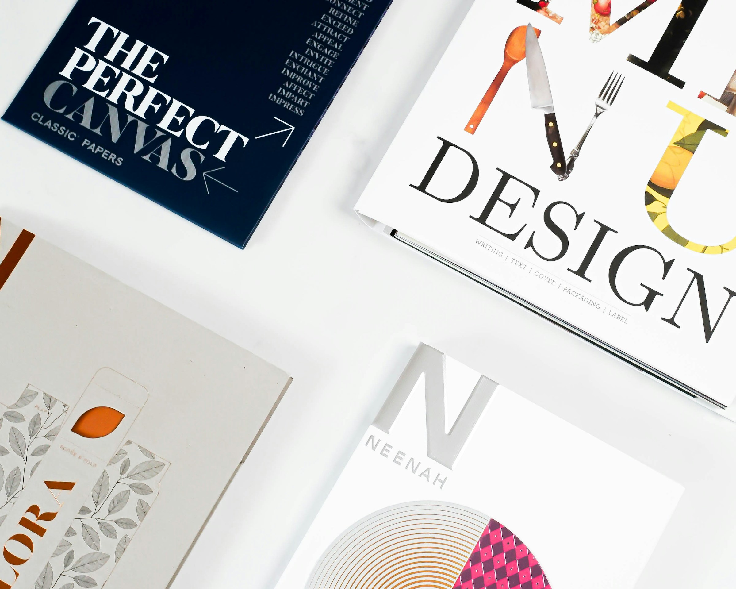
Typography shapes the route through a page. A reader should be able to distinguish the main message, supporting explanation, and next action before reading every sentence. When all three look equally important, adding another font rarely solves the problem.
Design the hierarchy before choosing the style
Write a sample page using real content. Mark its title, section headings, body text, labels, and captions. Give each role a consistent treatment, then remove any role that exists only to decorate one unusual page. A compact hierarchy is easier for a team to maintain than a catalogue of near-identical styles.
Test the hardest content first
A short headline may fit beautifully while a longer service name wraps into an awkward column. Test both. Include dates, prices, punctuation, and the languages your business actually uses. Review body text on a phone and in a printed proposal; a style that looks comfortable on a large design monitor may feel crowded elsewhere.
Use line length and spacing to support reading. If paragraphs feel tiring, try narrowing the text column or increasing the space between lines before increasing every font size. Keep related information visually close and separate unrelated sections more clearly.
Make emphasis deliberate
Reserve bold text for useful distinctions, such as a recommendation or a named step. Avoid placing entire paragraphs in capitals or italics. Links should remain recognisable within a paragraph, and their meaning should not depend only on a subtle colour change.
Create a repeatable type specimen
Build a reference page containing a long heading, two body paragraphs, a list, a caption, and a button. Use it whenever a new template or page is added. Ask a colleague to scan the specimen and explain its main point. If they cannot tell what matters first, revise the hierarchy before polishing decorative details.
Ready to put these ideas into practice?
Talk directly with our senior technology and branding partners.
Related Articles & Insights
Build a Visual Identity Your Team Can Actually Use
Turn a logo, colour palette, and typography into a practical identity system that works across everyday business materials.
Choose a Colour Palette That Works Beyond the Mood Board
Give brand colours clear roles, test real combinations, and build a palette that remains useful across digital and printed materials.
Your next move
Have an idea?Let's make it matter.
Tell us where you want to go. We'll help map the clearest route from ambition to impact.
Start a conversation