Events & celebrations
Evercraft Events
A bold event brand combining a geometric mark, deep blue and bright yellow, with website and business card designs.
Brand identity & web design
The identity
A distinctive visual language.
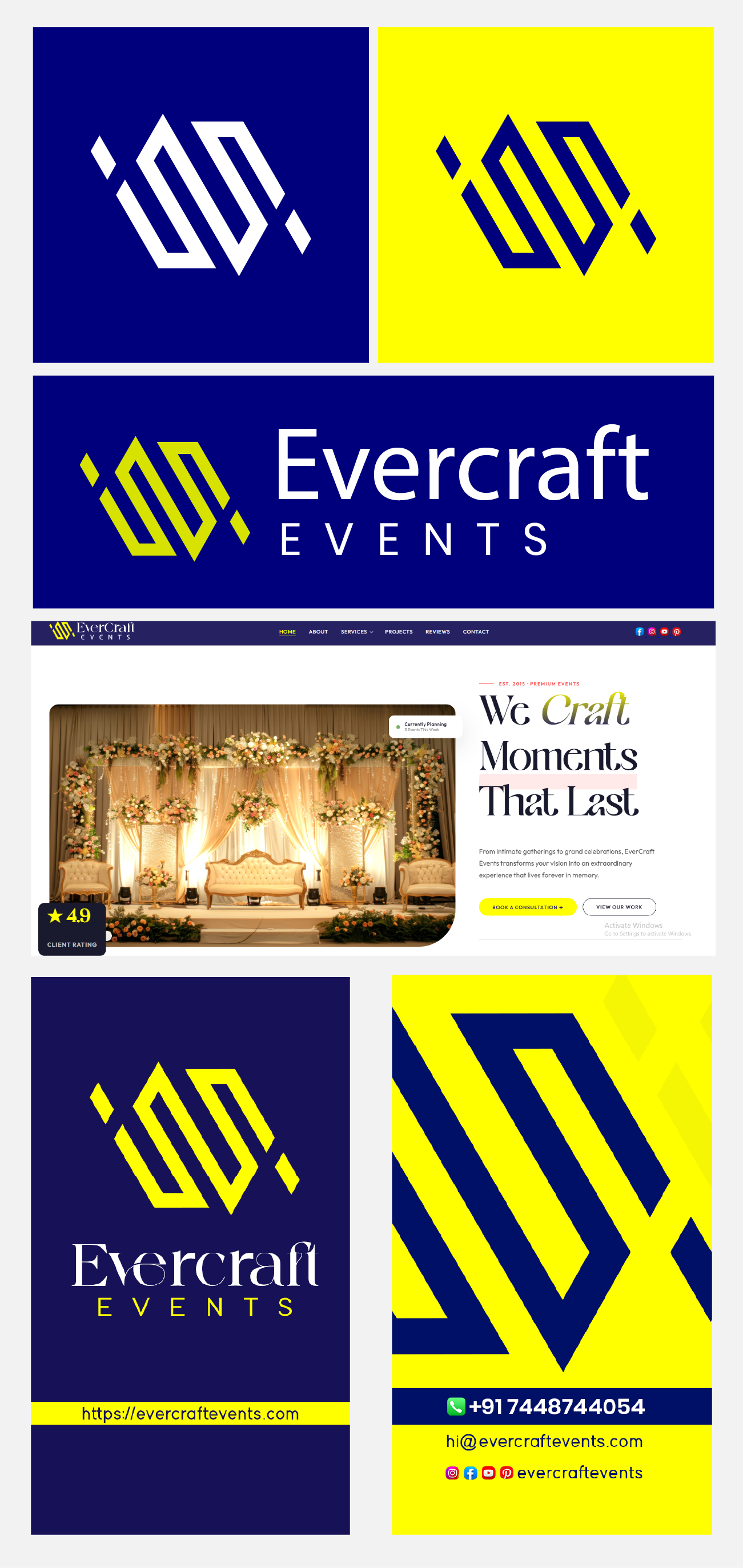
The Evercraft Events identity centres on an angular geometric symbol paired with the brand name. The presentation brings together standalone marks, wordmark arrangements, and applications for an events business.
Design direction
One identity, across every application.
Deep blue and bright yellow create a strong contrast across the identity. The website design pairs celebration photography with expressive typography, while the business cards use the geometric mark at different scales.
Design details
From the mark to the moments that matter.
A geometric symbol in contrasting colour variations
Detail 01
Horizontal and stacked brand arrangements
Detail 02
An event-focused website design with celebration imagery
Detail 03
Business card layouts extending the identity into print
Detail 04
Your next move
Have an idea?Let's make it matter.
Tell us where you want to go. We'll help map the clearest route from ambition to impact.
Start a conversation