Hospitality
Rajali Residency
A navy and gold hospitality identity, expressed through a crowned bird emblem, distinctive typography, and guest-facing brand applications.
Brand identity
The identity
A distinctive visual language.
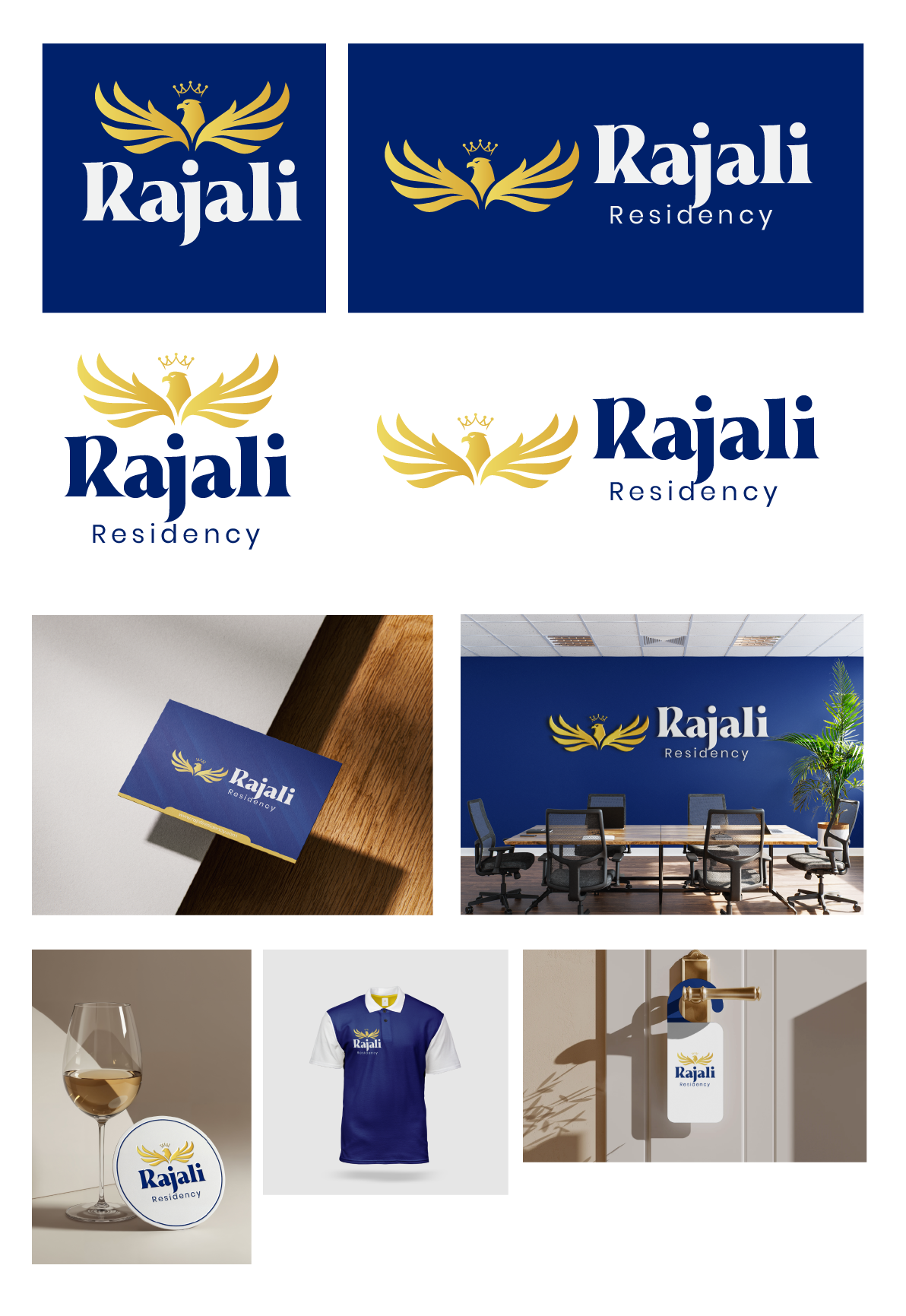
The Rajali Residency identity pairs a crowned bird with a wide wing silhouette and an expressive wordmark. The presentation explores how the identity appears in both compact and horizontal arrangements.
Design direction
One identity, across every application.
Deep navy and gold establish the palette, supported by white space and contrasting typography. The logo is carried into stationery, wall signage, staff apparel, and small guest touchpoints to demonstrate a consistent hospitality identity.
Design details
From the mark to the moments that matter.
Horizontal and stacked logo compositions
Detail 01
Navy, gold, and white colour variations
Detail 02
Signage and stationery mockups
Detail 03
Coaster, uniform, and door hanger applications
Detail 04
Your next move
Have an idea?Let's make it matter.
Tell us where you want to go. We'll help map the clearest route from ambition to impact.
Start a conversation