Education & IT training
V Kode Infotech
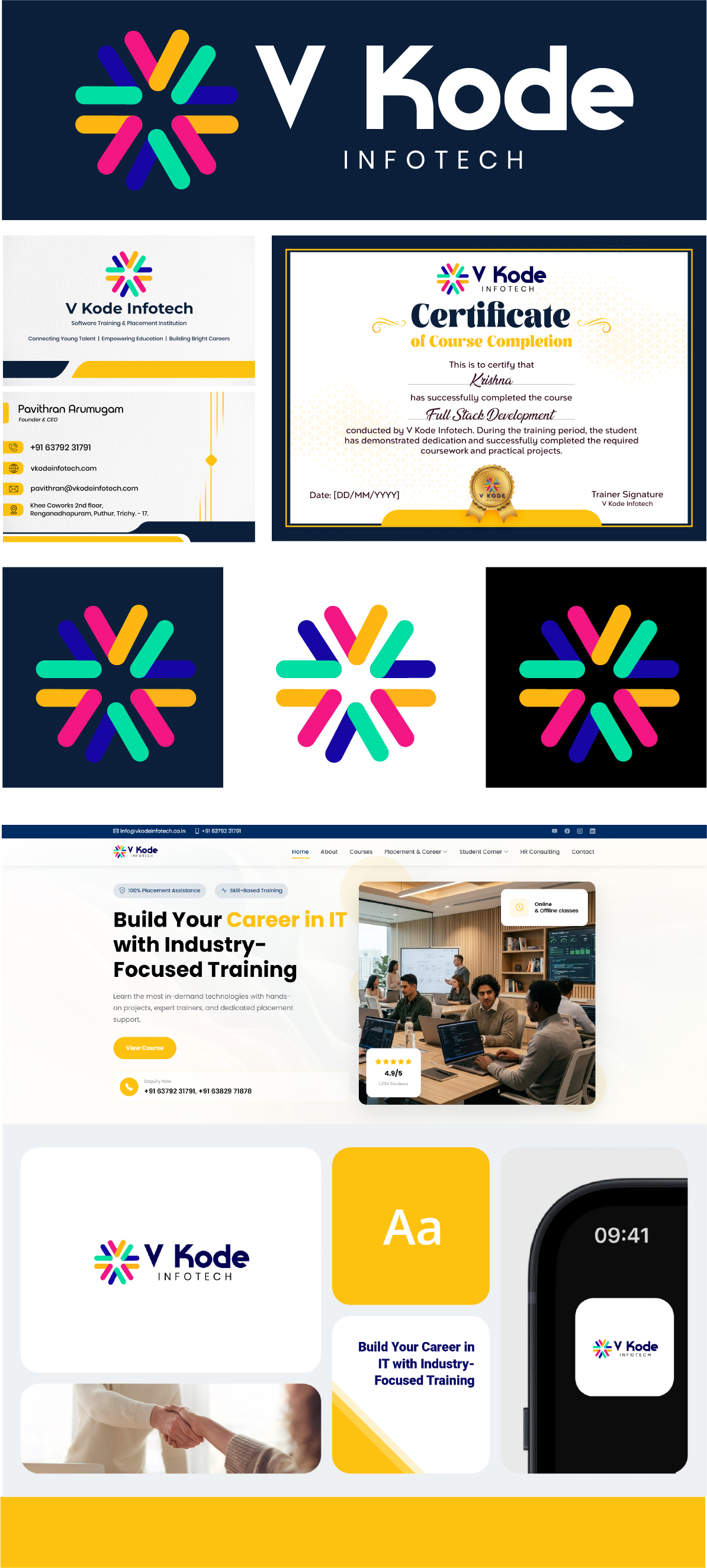
A vibrant visual identity connecting an IT training brand across print, certificates, and website design.
Brand identity & web design
The identity
A distinctive visual language.
V Kode Infotech is presented as a software training and placement institution. The identity brings its name together with a colourful radial symbol, giving the brand a recognisable mark across learning materials and digital touchpoints.
Design direction
One identity, across every application.
Navy anchors the identity, while yellow, pink, green, and violet bring energy to the symbol. The presentation carries this visual language through business cards, a course completion certificate, and an education-focused website design.
Design details
From the mark to the moments that matter.
A multicolour symbol with light and dark variations
Detail 01
A consistent wordmark across print and digital layouts
Detail 02
A certificate design aligned with the brand palette
Detail 03
Website and device mockups extending the visual identity
Detail 04
Your next move
Have an idea?Let's make it matter.
Tell us where you want to go. We'll help map the clearest route from ambition to impact.
Start a conversation